
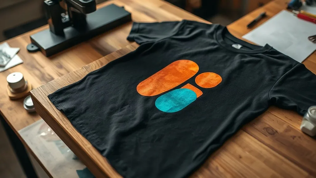
There is a moment every small print shop owner remembers: the first time a design that looked perfect on a white tee came off the press on a black shirt and looked washed out, chalky, or just plain wrong. Nothing about the setup changed. Same printer, same dtf transfers film, same heat press, same powder. Only the garment changed. And that single variable can quietly undo everything you thought you knew about your workflow.
Dark garments are where dtf printing either proves its reputation or exposes its weak points. The good news is that the process is designed to handle them well. The catch is that a few settings that feel harmless on light fabric become critical once the background goes black, navy, or deep forest green. This piece walks through what actually changes and how to adjust for it.
Why dark fabric changes the rules
DTF printing works by laying down a white ink layer on the film, then printing color on top of it. That white layer is the reason DTF can print on almost any fabric color without a separate underbase. On a white shirt, the white ink and the shirt blend together, so imperfections in the white layer are invisible. On a black shirt, that same white layer is doing heavy lifting. Every thin spot, every uneven patch, every area where opacity drops shows up immediately.
This is why two shops using identical equipment can get wildly different results on dark garments. The difference is rarely the printer. It is how carefully the white ink is laid down, cured, and pressed.
The white ink layer is the whole game
Think of white ink as the foundation of a house. If it is uneven, everything built on top of it leans. A solid, consistent white layer gives color something opaque to sit on, which produces the saturated, punchy look customers expect. A thin or patchy white layer lets the dark fabric bleed through, and suddenly a bright red logo looks maroon.
If your printer allows you to adjust white ink density, resist the urge to save ink on dark garment jobs. That is the wrong place to economize.
Contrast and color choice: what looks good on paper versus on a black tee
Designers often build artwork on a white canvas and only later decide which shirt it will go on. That order of operations causes problems. Colors that pop on white can disappear on black, and outlines that seem subtle on screen can vanish entirely in print.
- Deep blues, purples, and dark reds are the usual casualties. They have low contrast against black fabric and read as muddy.
- Bright yellows, oranges, and light greens tend to hold up well because the contrast is high.
- Thin white outlines around dark text can save a design, but only if the white layer underneath is solid.
- Gradients that fade to a dark color will look like they fade into nothing on a dark shirt.
A quick habit worth building: before you send a design to print, preview it against a black background at actual size. If you cannot read the key elements in that preview, the printed version will not be better.
When to add an outline or a backing shape
Sometimes the fix is not a color change but a structural one. Adding a thin white or light-colored outline around a design creates separation between the artwork and the dark fabric. It also buys you a small buffer against registration issues during pressing, which is useful when you are pressing dozens of pieces and cannot inspect every one with a loupe.
Film and powder choices that matter more on dark fabric
Not all film behaves the same way, and the differences become obvious on dark garments. Thicker films tend to hold white ink more evenly and release more cleanly, but they can feel stiffer on the finished shirt. Thinner films press flatter and softer, which customers appreciate, but they demand more control during powder application.
Powder is the other half of the equation. Too little powder and the transfer will not adhere properly, which shows up as patchy areas on dark fabric long before it shows on light fabric. Too much powder and you get a stiff, plasticky hand feel plus excess buildup that can transfer onto the press platen over time.
Shake the powder evenly, apply in a thin layer, and tap off the excess rather than brushing it. Consistency here matters more than quantity.
Press settings for dark garments: small adjustments, big differences
Most press settings are roughly the same across fabric colors, but dark garments reward a slightly more careful approach. The reason is simple: you cannot see the transfer through the shirt, so you are relying entirely on time, temperature, and pressure to do the job correctly.
- Temperature: stay in the range your film manufacturer recommends. Going hotter to compensate for darkness does not help and can scorch the fabric or damage the ink.
- Pressure: medium to firm, consistent across the platen. Uneven pressure is the most common cause of partial adhesion, and partial adhesion on a black shirt is much harder to spot before it becomes a customer complaint.
- Time: follow the film spec. Pressing longer does not improve opacity and can flatten the hand feel.
- Pre-press: a quick pass over the garment to remove moisture makes a real difference, especially on heavyweight cotton.
If you are buying transfers rather than printing in-house, ask the supplier what press settings they test with. A shop that runs a professional dtf transfers near me operation should be able to tell you exactly what works with their film.
Cool peel versus hot peel on dark fabric
Peel timing is one of those details that seems minor until it ruins a job. Hot peel is faster and often gives a slightly glossier finish. Cool peel tends to produce a smoother, more matte surface and can reduce the risk of the transfer shifting during removal.
On dark garments, cool peel is generally the safer choice. It gives the ink a moment to settle and reduces the chance of pulling up part of the white layer along with the film. If you are pressing a high volume and time matters, test both methods on scrap fabric first and see which gives you a cleaner result with your specific film.
Wash durability: what to expect and how to protect it
Customers ask about wash life constantly, and dark garments are where failures become most visible. A crack in a print on a white shirt is subtle. The same crack on a black shirt shows white lines through the design.
The main factors in wash durability are adhesion quality and ink flexibility. Both are set during pressing. A transfer that is pressed with the right pressure and temperature will hold up through dozens of washes when the garment is cared for properly. Turn the shirt inside out, use cold water, and avoid high heat in the dryer. Those three habits extend print life more than any product on the market.
If you are testing a new supplier, run a wash test before committing to a large order. Print a sample, wash it five times, and inspect it in good light. That five-wash test tells you more than any spec sheet.
Frequently asked questions
Can DTF transfers be used on black shirts without a white underbase?
The white ink layer is built into the transfer film itself, so you do not apply a separate underbase. The transfer already contains a white layer beneath the color. Your job is to make sure that layer is solid and fully cured.
Why do my prints look dull on dark fabric but fine on white?
Dullness on dark fabric usually means the white ink layer is too thin or uneven, letting the fabric color show through. It can also come from insufficient press pressure, which prevents full adhesion. Check both before changing your ink or film.
Does pressing temperature need to change for dark garments?
Generally no. Temperature should follow the film manufacturer's recommendation regardless of fabric color. What changes is your attention to consistency, since defects are harder to spot on dark fabric before they become a problem.
How long should I wait before washing a DTF print on a dark shirt?
Wait at least 24 hours after pressing before the first wash. This gives the ink and adhesive time to fully settle. Cold water and inside-out washing will keep the print looking sharp for far longer.
The takeaway
Dark garments are not harder to print on, but they are less forgiving. The white ink layer, the powder application, and the press consistency all matter more because there is no white fabric to hide small mistakes. Get those three things right, and dtf printing on black, navy, and deep colors will deliver the same vivid results you get on light fabric, with a look that customers tend to prefer.